
Through user interviews, some key pain points were revealed within the user flow for the Click & Drop feature:
The Click & Drop product was redesigned to solve these problems, while also focusing on providing a mobile friendly experience which they were previously lacking.
Structure of the Click & Drop process and how users will move through it to accomplish their goal of creating a shipment (including paying and getting a label) to quickly drop at the post office:

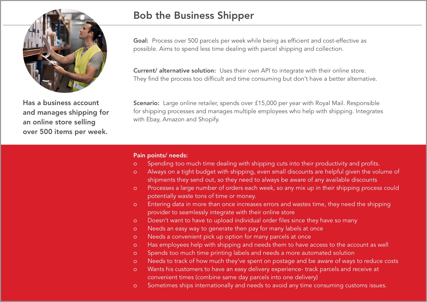
Three main personas were identified as the target users for this feature- guest shippers, frequent shippers, and business shippers. All had varying needs and requirements throughout the process of creating the shipment but similar goals in the end- to easily and efficiently ship packages.

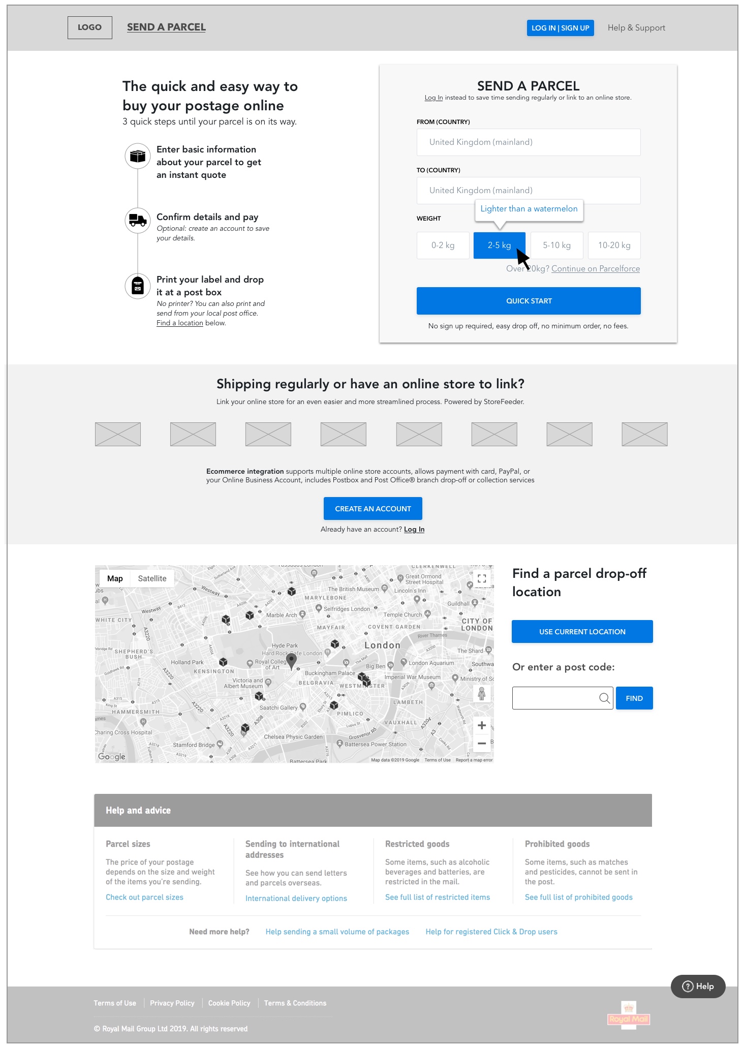
Updated homepage for desktop:
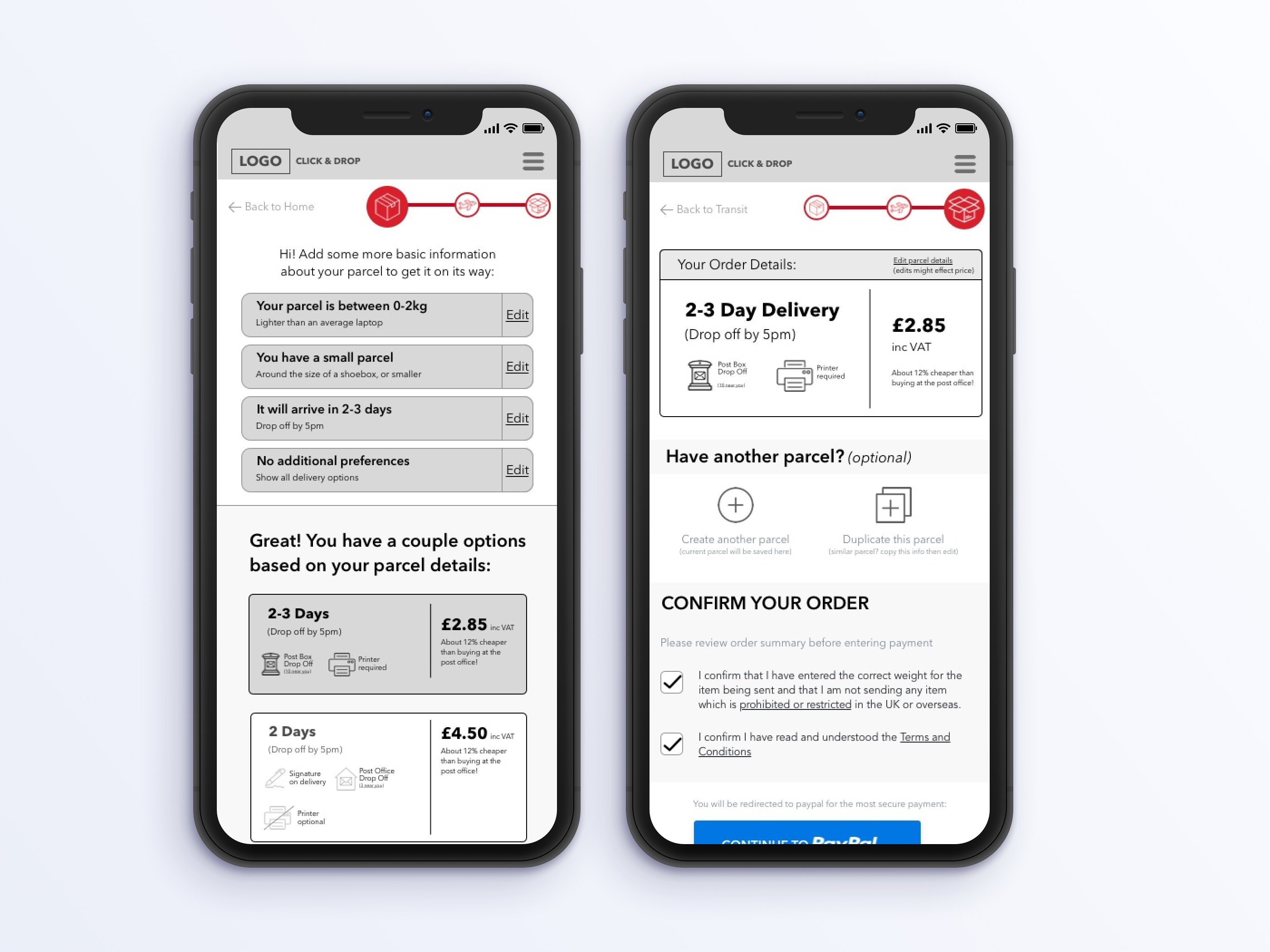
High fidelity wireframes (mobile):

These deliverables were completed using the Royal Mail branding assets and guidelines, in collaboration with a project manager and design director.

Check out some other projects you might like
Get in touch today.

kiri@kiricreative.com


